How to Annoy Your Survey Participants in Six Easy Steps

This post originally appeared at Vince Filak’s Dynamics of Writing blog and is reposted with permission. The second edition of Filak’s Dynamics of Media Writing: Adapt and Connect published this month.
As a researcher, I end up asking a lot of people to participate in surveys I’m doing and studies I’m conducting. As such, I feel compelled to reciprocate whenever someone out there is asking for help in a similar vein. Thus, when a survey from one of my alma maters landed in my in box, I decided to give it a shot. Ten minutes out of my life? Happy to help.
I’m not sure how much help I was to the people who put the survey out, but given the various problems I had with this survey, I’m hoping I can help you all learn how to avoid what went wrong for them. Thus, you have today’s look at how you can really annoy your survey participants in six easy steps:
STEP 1: Fail to Beta Test the Hell Out of It Before You Roll It Out
This is perhaps the simplest rule for trying to gather information from people who really don’t owe you anything: Make it a simple, intuitive and error-free experience.
To do that, you need to have people within the group or who won’t be part of the larger data pool take your survey before you send it to your population/sample. This is where you work out the kinks, troubleshoot confusing items and generally make sure you don’t look dumb. It became clear to me in the first screen that this group failed to do this:
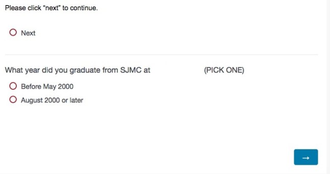
(NOTE: The blank spot is where the name of the university was. I deleted it to be decent.)
OK, do I click “next” to continue before or after I select my graduation group? Also, does clicking “next” move me to the next screen or do I need to click the arrow (something that seems more intuitive)? I tried a few ways of doing this and the only rule seemed to be that I had to make a click on “next” and pick my year at some point before I clicked on the arrow (which I was never actually told to do).
You are conducting a survey, not giving me a game of “Oregon Trail.” Make sure I know what I need to do or that you tell me how to do it simply. That’s one big thing in pretesting digital surveys.
STEP 2: Don’t Give Me Choices When I Actually Need Them
In some cases you want people to tell you multiple things on an item (Which of the following ice cream flavors do you like? Select as many as you want). In other cases, you want to force a choice (Which flavor of ice cream is your favorite? Select one.) When it comes to forced choices, you need to make sure you WANT to force the choice and that the forcing of that choice is conveyed to the participant in a way that allows him or her to make the best choice. Here’s where it doesn’t work:
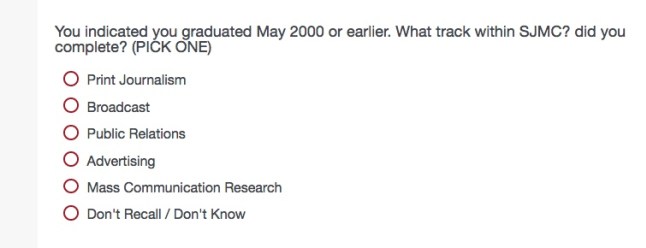
OK, but I did both Print and Broadcast. Which am I supposed to pick? The one most closely attached to my job? The one I liked best? The first one?
This happened at least twice more in this survey:
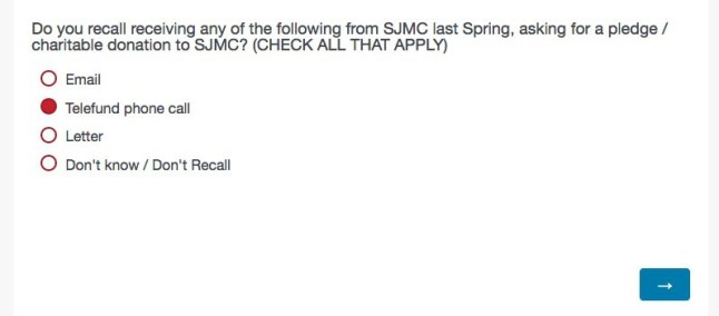
(I tried to click more than one and couldn’t. Trust me, this place has no trouble finding me for stuff like this.)
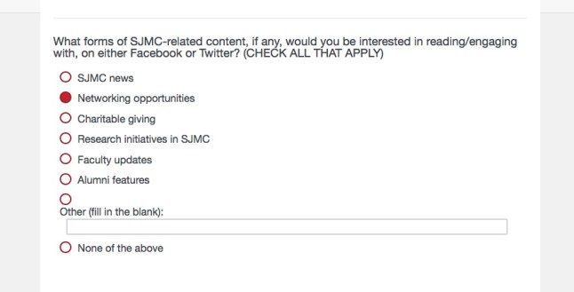
(Again, “all that apply” turned out to be “pick one.”)
If you want to force a choice where I might want to select more than one, remember the ice cream example: Tell me to pick a specific item (your favorite flavor). If that isn’t clear, explain what you want me to do if I fit more than one category (If you completed more than one track, please select the one you most closely associate with your current field of employment.). This will put the onus on the participant to choose, while still giving the person a sense of direction.
STEP 3: Give Me Mutually Exclusive Options That I Can Mess Up
As we noted before on this blog, people can be jerkweeds for their own sense of enjoyment. You want to make sure they don’t have ways to screw up your data. In a similar vein, you don’t want to give people a chance to mess something up accidentally as well. This can happen when you give me mutually exclusive options that I can select simultaneously, as you can see below:

I could check all of the boxes I wanted, even though it makes no sense to say that I will tell you all of the things I donate to even though I donate to none of them and prefer not to tell you about it. If you need to get at if I donate or not, you can do one item that forces a choice (Do you donate money to organizations of any kind? Y/N/Won’t say) and then let the choice on that lead to another question. This is called logic within digital programs and allows people who pick “Yes” to get a screen filled with potential places you donated money (non-profits, universities, OTBs etc.) and people picked anything other than “Yes” to skip that item and drop into the next “everyone gets to answer” question.
(To be decent to the people doing the survey, I unchecked the options that didn’t make sense and answered honestly. It seemed like the right thing to do…)
STEP 4: Give Me a Measurement Tool I Don’t Fully Understand
People generally understand simple choices like rankings (Of the following three sports, please rank them in the order you enjoy watching them, with your favorite choice ranking first and your least-favorite choice ranking third.). People also are used to scales if those scales have numbers that attach themselves to choices (On a scale of 1 to 5 in which 1 = Strongly disagree, 3 = Neither agree nor disagree and 5= Strongly agree, please rate the following items.). However, when you have a set of rules and measurements like we’re playing “Bamboozled,” you will annoy the hell out of your participants. Consider these three answers:

According to the numerical equivalency the sliders gave me, each of these answers correspond to the number 5 on a scale of 1-7. I have no idea if that’s true or if my positioning of the sliders will indicate that I like Learning/Enrichment much more than career advancement (if I move either of those sliders just a teeny, tiny bit to the right and left respectively, you have a two-point gap on a seven-point scale). If I really wanted each of them to be EXACTLY 5, did I need to align them perfectly? And if so, where along that “five continuum?”
Why we needed sliders for this was beyond my ability to comprehend, as buttons with numbers would have worked out just fine.
STEP 5: Confuse Me by Telling Me How I Answered Something and Don’t Let Me Check on It
In some cases, you will want to reaffirm people’s choices before they proceed on a question (You noted that you have a Ph.D. How many years beyond your master’s degree did it take for you to complete that degree?). However, you don’t want to confuse people for no good reason. I was asked this question:
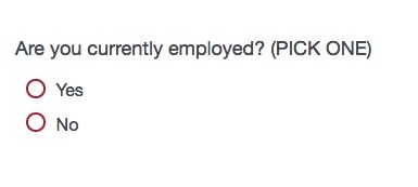
I picked “Yes” and then went on to a second screen where I was given some particularly unhelpful options regarding my rung on the corporate ladder. Once I finished that, I got this:
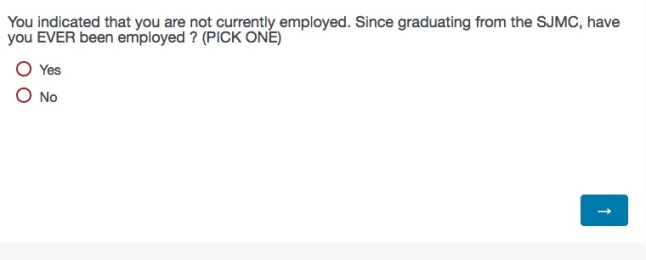
Well, I said I AM employed, so I’m worried that I’m screwing up their data set. I want to go back and check, but I was not only unable to do it with an arrow at the bottom of the page (“Forward” is not only our state motto but also the edict of this survey.) but I couldn’t use the browser’s “back” arrow either. Fortunately, they sent me another link and I did the same thing and found that, no, I wasn’t screwed up. The survey was.
The same thing was true of confusing items like this one:
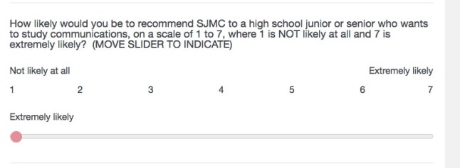
Which “extremely likely” is the right one? Or is this like a Russian election and you just really want me to pick something supportive?
STEP 6: Waste My Time
Research (particularly marketing research) is supposed to be mutually beneficial. In other words, the goal is for the organization to learn something and the participant to feel good about taking part in the work. The best response you can hope for from participants is, “That was pretty interesting. I’d like to know what you find out.” The worst response you can get is what I got from a friend of mine who just completed the same survey:

Before you go through the trouble of asking people to help you, make sure you are doing your level best to be respectful of their time. Give them a clean, clear and simple instrument, have all the kinks ironed out and make sure they feel as good about the process as you do.


