How Can Wise Graphics Use Cut Through the Complexity of COVID-19?
Editor’s Note: If you’re curious about the ways in which data visualization and graph use can generate impact with regard to the coronavirus, please also check out our other recent post, “People Do Not Understand Logarithmic Graphs Used to Visualize COVID-19.“
The international COVID-19 response so far makes clear that ‘one size doesn’t fit all’, and that the urgent interpretation and application of science is hugely challenging and is framed by political room for maneuver.
‘One size doesn’t fit all’ is easy to say, but hard to do. As well as its immediate biological effects, the COVID-19 pandemic is highlighting a huge range of ‘cracks’ in social, economic and political systems around the world, in high-income countries as well as low- and middle-income ones.
Many years of evidence point to the need for development interventions to be politically informed and grounded in the local context, and COVID-19 interventions are no different. It is hard to do this with nuance, though, particularly at pace and at this sort of global scale. The virus isn’t slowing down so that science can catch up – whether science is medical, technological, social, political or economic.
COVID-19 and [..everything..]
The last few weeks have shown that the harder you look at COVID-19, the more there is to worry about. Thankfully, we are beginning to see a rapid roll out of ‘COVID-19 and ……’ evidence-based analysis covering a huge range of subjects, from global supply chains to organised crime to education and so on. The volume of analysis coming in can be overwhelming, especially as each article, each blog often triggers a whole series of ‘if this, then that’ thinking. If slums, then refugee camps, then prisons, then…what else?
The urgent medical and public health response needs are clear, including protective equipment for health and other key workers, infection control and the development of new technologies such as vaccine, diagnostics and treatment. There are discoveries and innovations to catalyze and test, standards to comply with, supply chains to mobilize, manufacturing to (re)direct and complex delivery systems to establish.

But experience earned the hard way through a whole range of complex emergencies – Ebola, cholera, earthquakes, terror attacks and so on – tells us that it is social, political and institutional efforts that will be the ‘software’ determining the effectiveness of our collective response. These are key to understanding vulnerabilities and for ensuring that ‘Do No Harm’ is at the top of the agenda, and they require strong social science research. We need a truly multidisciplinary approach to begin to get to grips with this extraordinary global crisis.
Bringing social and political research into Covid-19 interventions
Ever been annoyed by social scientists saying ‘it’s complex’ or ‘context is really important’? Well, hold tight, because COVID-19 has multiplied this by a zillion. To try and cut through the tangles of complexity wrought by a global pandemic, I’ve been working with Peter Evans (and his multi-talented daughter, Hamsi Evans) to put together some picture ‘explainers’ to help frame thinking. These are helping communicate around the complex problems we’re all facing and how to use social science research to tackle these.
Cutting through complexity
The first set of graphics features an adaptation of the ‘flattening the curve’ graph and helps to convey something that I’m sure many organisations around the world are grappling with. A picture really can be worth a million words.
The first picture is the typical ‘flattening the curve’ model but brings in the reality of how important the specific context – and the actual capacity of the health system in question – is to this. There are reasons why some systems have greater capacity and why others don’t, and these reasons are complex, shaped at least in part by politics.

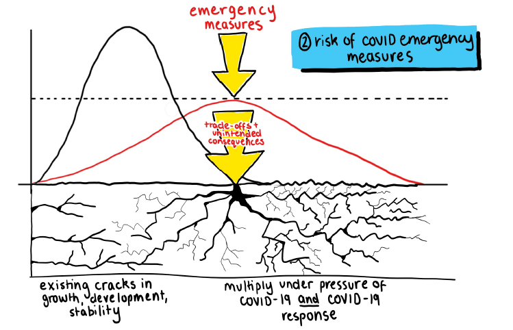
The second picture represents what we already know from previous emergencies, and what we’re seeing with COVID-19 already: that emergency measures, such as lock downs and physical distancing come with trade-offs in all contexts, and with risks of unintended consequences. These emergency measures land on foundations with existing cracks in growth, development and stability. These cracks can multiply under the pressure of COVID-19 itself, as well as the pressures from COVID-19 measures if implemented without taking context into account. While research can’t help us go back in time to fix these cracks, it can help us better understand ‘predictable unpredictabilities’ in order to help avoid unintended consequences.

Finally, the third picture expresses what we’re beginning to understand: that for some of the most vulnerable populations social and physical distancing is simply impossible, and we urgently need to think about the best alternatives in the hopes of saving as many lives as possible.

I can see us working on more of these graphics to try and project the very different effects that we may see: COVID-19’s effects on national elites, for example, and what this may mean for long term ‘social contracts’, politics and stability. Feedback on these – and suggestions for other pictures – are very welcome!


